Canadian Christian
Business Federation.
Ongoing social media design, leadership content series, event promotion, and newsletter graphics for a non-profit ministry connecting faith and work.
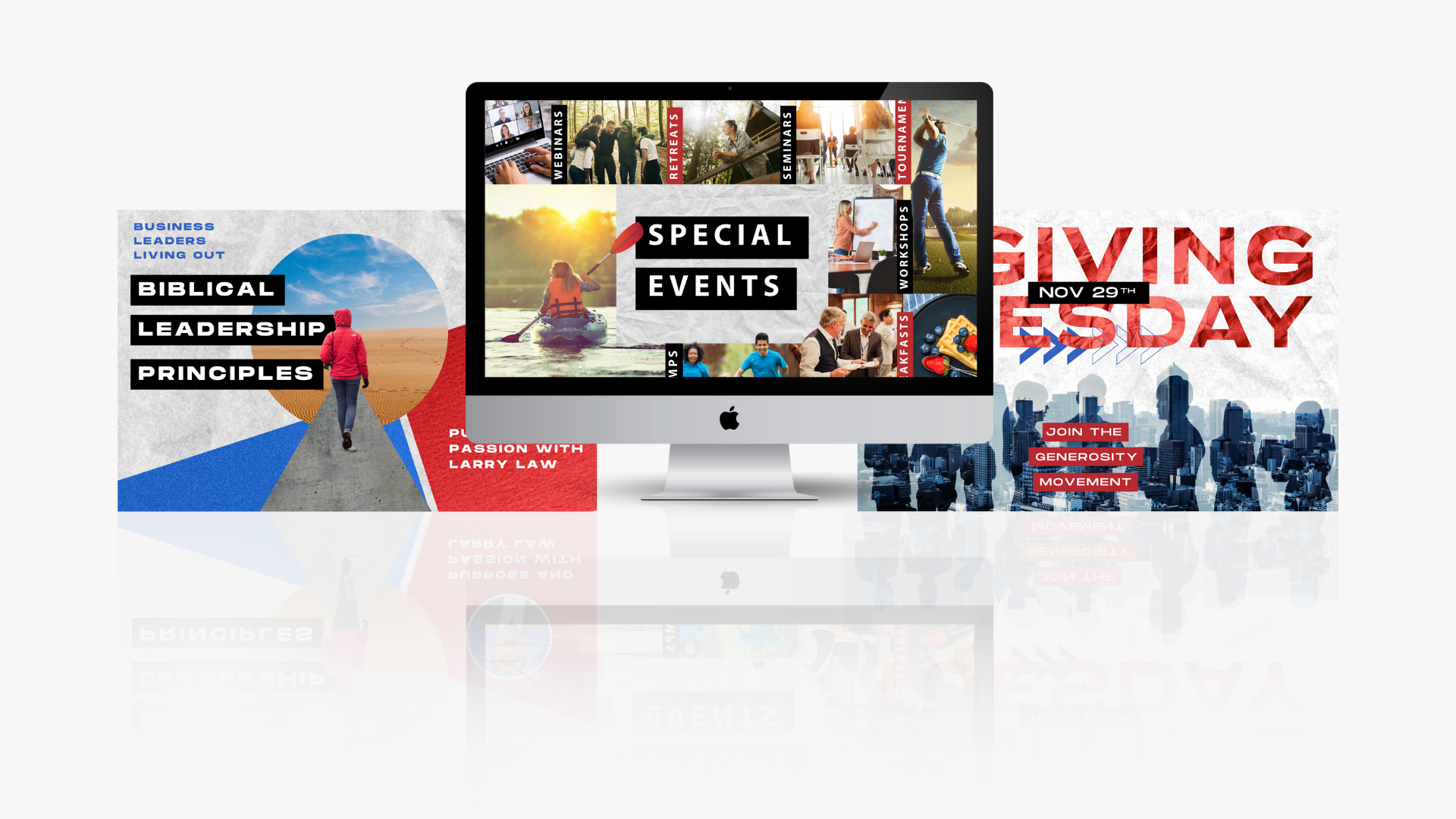
A mission worth showing up for.
Every week.
CCBF exists to connect Canadian business leaders to a community where faith and work aren't separate conversations. They run leadership series, speaker events, job boards, prayer initiatives, and more — all of it requiring consistent, on-brand creative that could hold its own in a crowded social feed.
The challenge wasn't a one-time rebrand. It was showing up week after week with content that felt intentional, not recycled — designed to reflect the seriousness of the mission while remaining accessible and visually compelling.
The work needed to feel like the organization: bold, grounded, and built for people who take both their faith and their work seriously.
An ongoing creative
partnership.
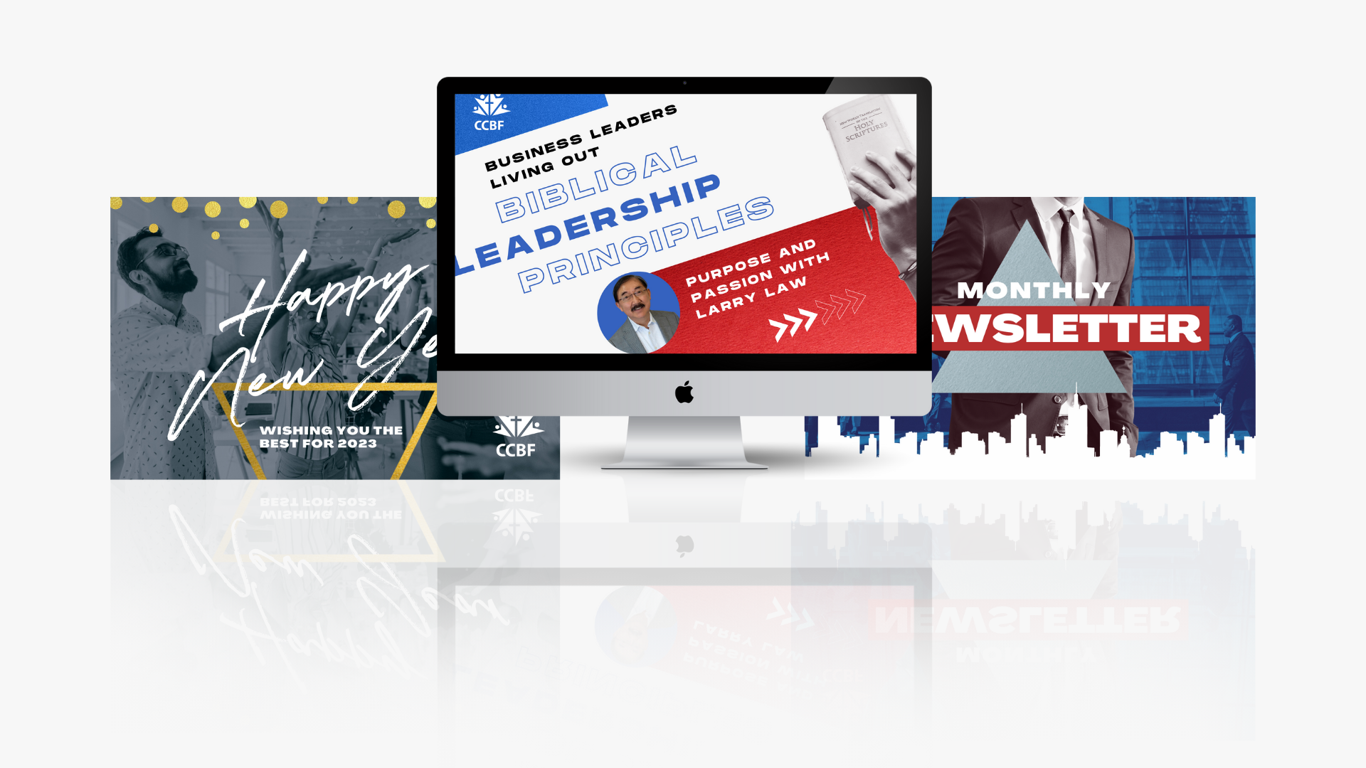
Leadership Series Graphics
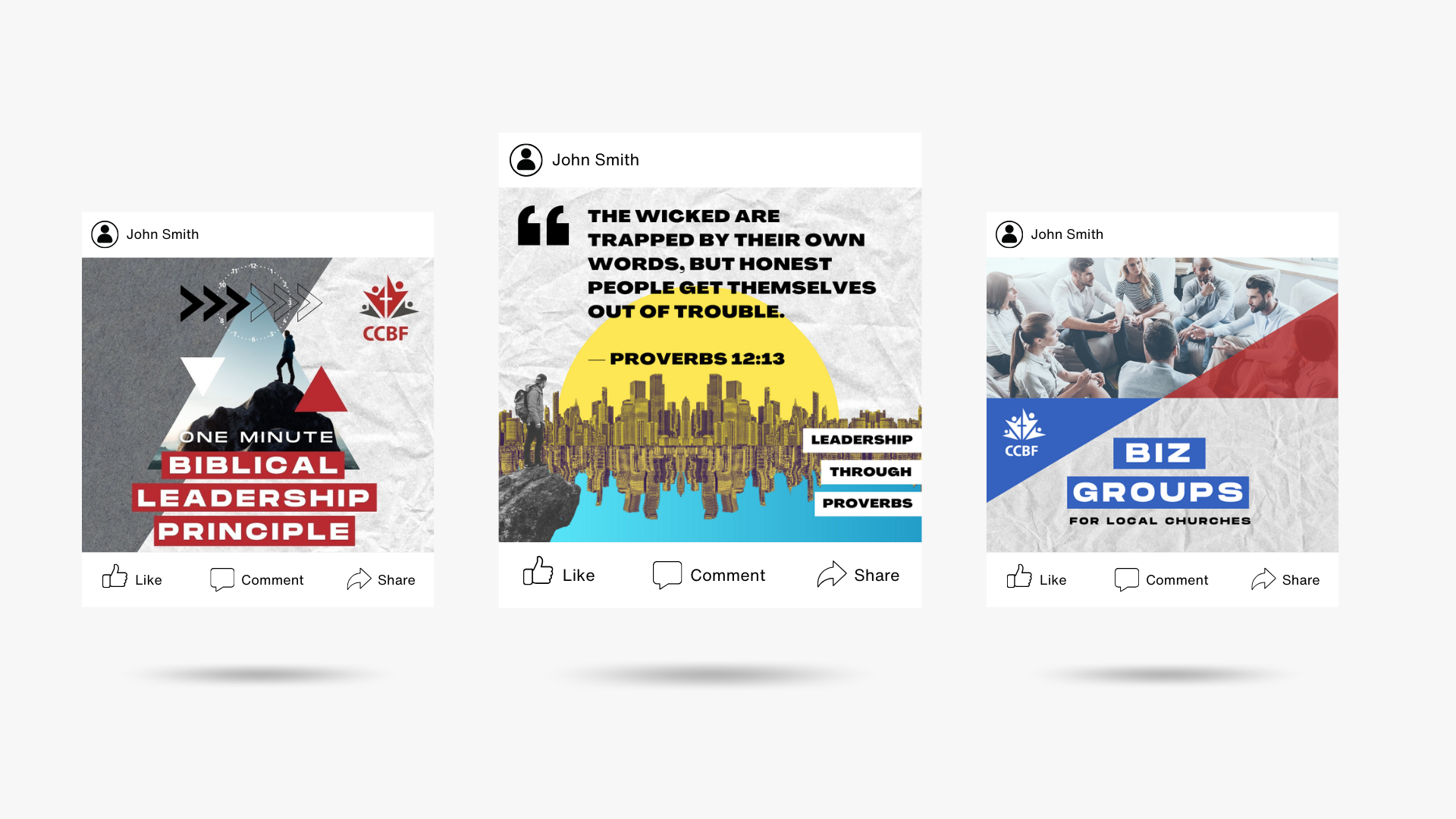
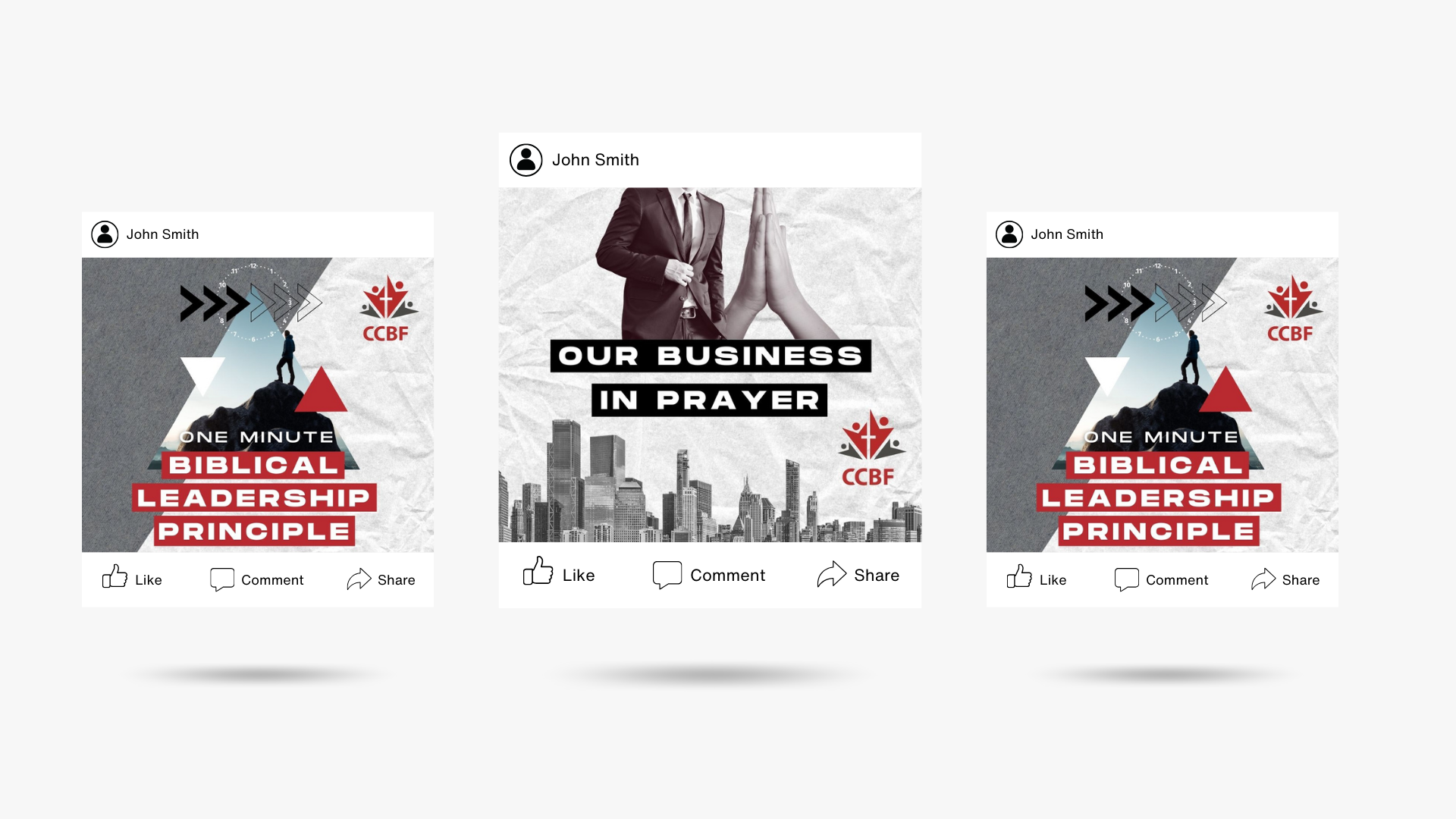
A recurring visual format for the "One Minute Biblical Leadership Principles" series — bold, recognisable, and built for weekly consistency without looking like a template.
Speaker & Event Promotion
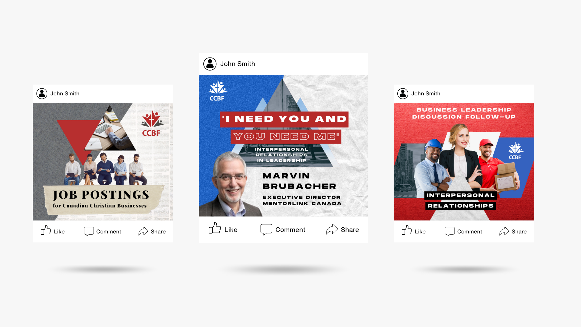
Custom graphics for featured speakers, business leadership discussions, and panel events — designed to give each person and topic the weight it deserves.
Scripture & Devotional Posts
Typographically driven quote graphics for weekly scripture and leadership reflections — high contrast, bold, and built to stop the scroll.
Campaign Design
Special campaigns including Giving Tuesday, "Our Business in Prayer," and seasonal content — each with a distinct visual treatment while staying within the broader brand system.
Job Board & Community Posts
Promotional graphics for job postings and BizGroups — the practical, service side of the ministry that needed to be communicated clearly and engagingly.
Newsletter Design
Monthly newsletter graphics and email headers — keeping members informed and connected with the same visual quality carried across all channels.
Consistent. Bold.
Week after week.
Radio spots and
membership video.
Radio Commercial
Membership Benefits Video
Design that serves
the mission, not just
the feed.
Non-profit social media often falls into one of two traps: polished but impersonal, or authentic but amateurish. The goal here was neither — it was content that felt like it came from a real community with something real to say.
The visual system uses bold typography, high contrast, and a consistent colour language (red, white, black) that reads as confident and trustworthy without being corporate. Each content type — leadership series, events, devotionals — has its own visual logic within the larger system.
The result is a feed that looks intentional at every scroll depth, whether someone is seeing CCBF for the first time or the fiftieth.
Running a non-profit
that deserves better design?
Mission-driven organisations deserve creative that reflects the seriousness of their work. Let's talk about what that looks like for you.